
The best CV template for a CV is not the prettiest one.
It is the one that helps the right evidence land fast, for the role you want.
That means clear hierarchy, readable spacing, and a layout that does not bury your strongest points.
It also means checking the rendered page before you send it.
A template can make the same experience feel sharper, calmer, or harder to scan.
For a deeper look at that first pass, start with the recruiter first scan.
The goal is not to decorate your history.
The goal is to help the reader understand it faster, with less effort.
That is why template choice matters before editing begins. It shapes the page, not just the look.
If the structure is weak, strong experience can still feel scattered.
If the structure is clear, modest experience can read with more confidence.
Why template choice changes first-pass clarity
A CV template sets the visual hierarchy before anyone reads a single achievement.
The eye notices spacing, section order, and column flow first.
That first pass matters because it frames how your experience feels.
A clear layout can make the page easier to trust and easier to scan.
A crowded layout can make solid experience feel harder to find.
That is why template choice is part of the message, not just the decoration.
For structure and reading order, see the W3C Web Content Accessibility Guidelines.
The same content can look more decisive when the hierarchy is clean.
That is true for human review and for software that needs a legible page.
CVZilla’s guidance stays careful here: clarity, structure, and role relevance matter, but no template guarantees an ATS result.
A readable layout helps your content do its job.
A poor layout can slow the reader before your strongest evidence appears.
That delay matters when recruiters are comparing many CVs quickly.
Template choice should reduce that friction, not add to it.
How the same experience can need different hierarchy
Profile is the master CV source, so you can keep one reusable base and tailor from there.
Different roles may need different strengths to appear first, such as progression, project depth, specialization, or leadership scope.
Template choice should support the evidence you want noticed, not force every job into the same format.
A simple example: the same career history can look more relevant when the most useful proof appears sooner.
That is not rewriting the facts.
It is choosing a visual order that matches the job brief.
If you want a reminder that role fit is not the same as broad company fit, read Company fit and role fit are not the same thing.
For occupation structure ideas, the O*NET Online occupation profiles can also help you think about what evidence matters most.
The point is not to force one format on every role.
The point is to let the layout serve the evidence.
That is especially useful when the same background can be framed in more than one credible way.
One layout may lead with progression.
Another may lead with project evidence or technical focus.
Neither changes your history.
Both change what the reader notices first.
What role-appropriate means for ATS and human review
Role-appropriate does not mean flashy.
It means readable, orderly, and easy to interpret.
That standard helps both people and software.
But it is still not a guarantee.
ATS behavior differs by employer and vendor, so no template can promise a pass.
That is why CVZilla keeps the message grounded in structure and relevance.
A template should not trap the page in awkward columns or unclear section order.
It should keep the content legible when scanned quickly.
It should also leave enough space for the evidence that matters.
A good layout makes it easier to connect the role brief with your proof.
A bad one makes that connection work too hard.
This is why the product message stays simple: maintain one strong profile, then tailor with evidence for each opportunity.
That is more honest, and usually more useful, than chasing a mythical perfect CV format.
A role-appropriate template also avoids visual noise that distracts from substance.
If the design asks for attention, the content may lose it.
The safer standard is restraint.
Let the structure do the work, then let the evidence speak.
For the product’s own final-check mindset, see The final check that keeps a tailored CV honest.
For a broader standards reference, the U.S. Department of Labor is a useful reminder that jobs differ in required evidence.
That difference is exactly why one universal template is a weak idea.
How to tell when a template is helping or hiding
Use the template as a test for clarity.
Ask a simple question: does the right strength stand out first?
If the answer is no, the layout may be hiding useful evidence.
Watch for skills or achievements pushed too far down the page.
Watch for columns that compress important detail into a narrow strip.
Watch for type choices that reduce contrast or slow reading.
Accent color and font family can help, but only when they support the structure.
They should never compete with the content.
Section order matters too.
If the role needs leadership proof, that evidence should not feel secondary.
If the role needs project depth, the template should not make that depth hard to scan.
Previewing the rendered page is the best way to judge this.
The screen tells the truth faster than the settings panel.
If a layout looks good in theory but awkward in preview, trust the preview.
This is where careful tailoring stays honest.
You are not polishing away hard facts.
You are checking whether the page still tells the right story in the right order.
That is a small check with a big effect on readability.
It can save you from sending a CV that looks balanced but reads poorly.
It can also reveal when a cleaner layout would better support the job you want.
- Strong evidence appears early and clearly.
- Section order feels intentional for the role.
- Columns do not hide key details.
- Fonts and colors support reading, not distraction.
How to compare the base CV template in Profile
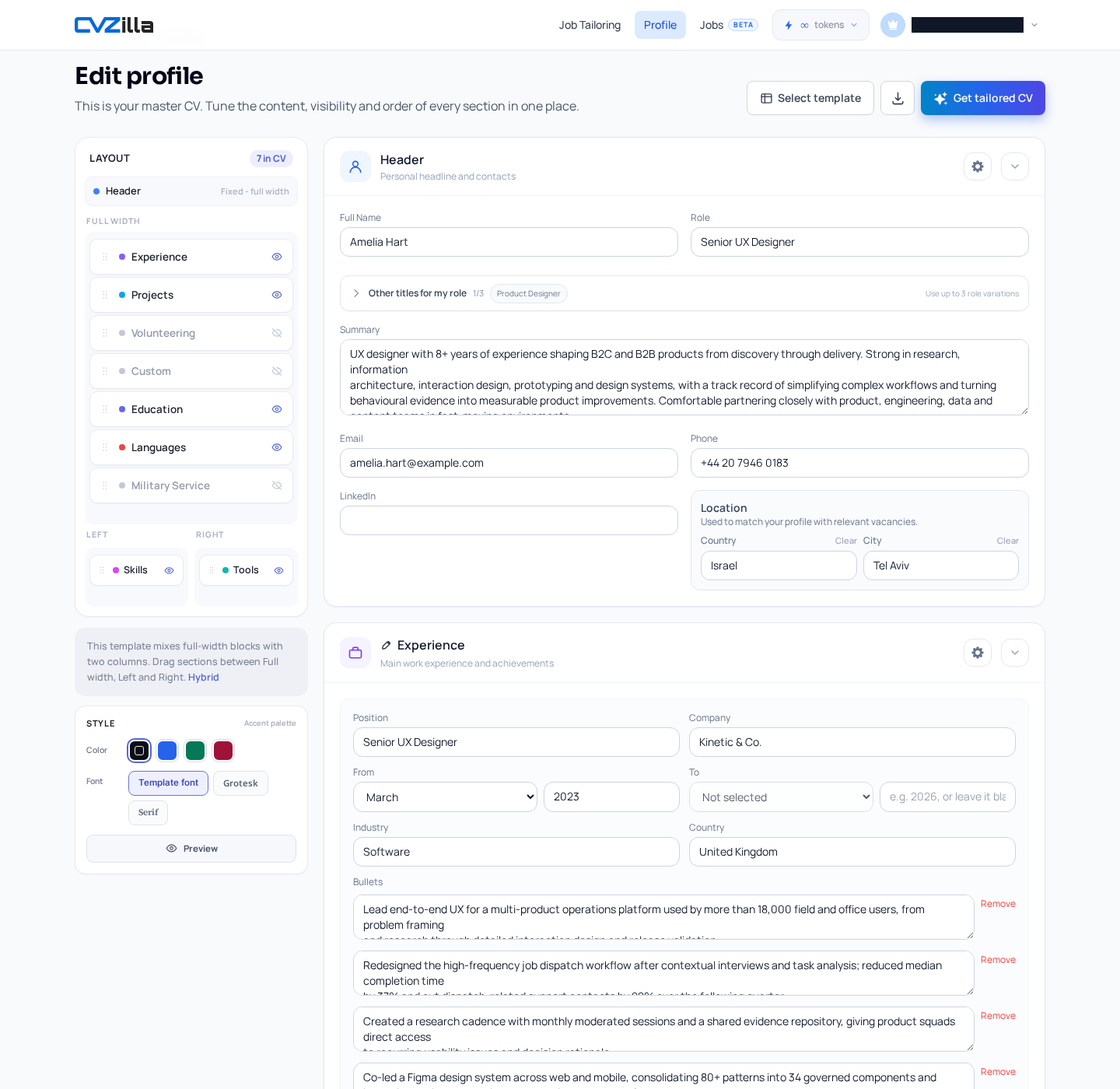
Open Profile to review your master CV.
From there, you can select a CV template and adjust presentation choices.
CVZilla lets you change accent color and font family.
You can also arrange supported sections across full-width and column-based layout areas.
The template controls affect the base and future CV template immediately.
That means each choice matters more than a one-off download setting.
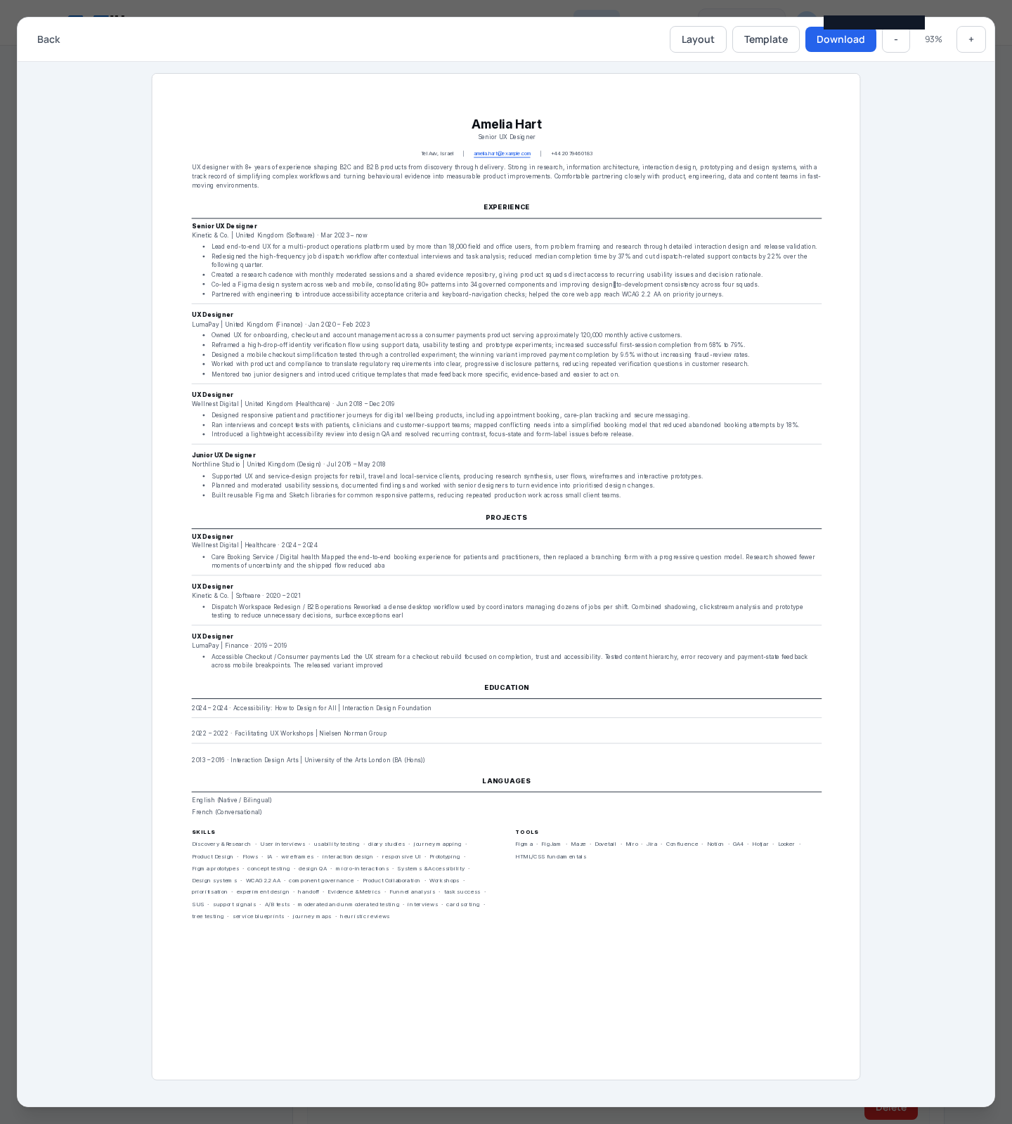
Use the preview workspace to inspect the rendered CV before you apply it.
The preview includes layout and template controls, so you can compare how the page actually reads.
That is the moment to check readability, hierarchy, and section order.
If the page feels busy, step back and simplify.
If the right evidence feels buried, try a different layout.
Template names can vary by account, so treat any examples as examples only.
The important part is not the label.
It is whether the rendered CV matches the role you are targeting.
When the preview feels honest, you are closer to a CV that works.
The main benefit is control.
You keep the same source of truth, then test presentation choices against the job in front of you.
That makes template selection a deliberate step, not a guess.
It also keeps later tailoring grounded in one maintained base.
For readers who want the final visual check, the preview is the place to do it.
If the rendered page reads cleanly, you have evidence that the layout is helping.
If not, you have a clear reason to adjust before applying.
Choosing a CV template is really a readability decision.
You are deciding what the recruiter sees first, and what the page makes easy to trust.
That is why the best CV template for a CV is the one that supports the role you want.
In CVZilla, Profile gives you a maintained master source, template controls, and a rendered preview.
Use them together.
Keep the base honest, then tailor the emphasis with evidence.
That is the practical middle ground between rigid formatting and vague design preferences.
It respects the job brief, the reader’s time, and the facts in your history.
If you want to compare your template and preview the result, open Profile.