
A strong CV does not need dramatic styling. It needs clear styling.
When a recruiter skims a page, the goal is speed and trust. The best CV font and color choices support both.
In CVZilla, the Profile area is where you manage the base CV’s presentation. You can change the template font, adjust the accent palette, and check the rendered preview before you move on.
That makes small style choices easier to judge in context. If you want a useful overview of the profile workspace, start with Profile.
Why scanability matters more than decoration
A CV is not a portfolio piece. Its first job is to help someone find the important details fast.
That means every styling decision should reduce friction. Font choice, color choice, spacing, and layout should all make the page easier to read at a glance.
CVZilla treats the Profile area as the reusable master CV, so presentation choices live where the base CV is maintained. That is useful because you can keep the document consistent instead of re-styling it every time you apply.
The more decorative a CV becomes, the easier it is for the reader to miss the point. A clean page is usually the safer choice because it lets experience, skills, and dates do the work.
- Aim for clarity first.
- Use styling to guide attention, not to entertain.
- Keep the page feeling calm and credible.
Font choices that improve speed of reading and preserve trust
A good font does not call attention to itself. It helps the reader move through headings, job titles, and bullet points without effort.
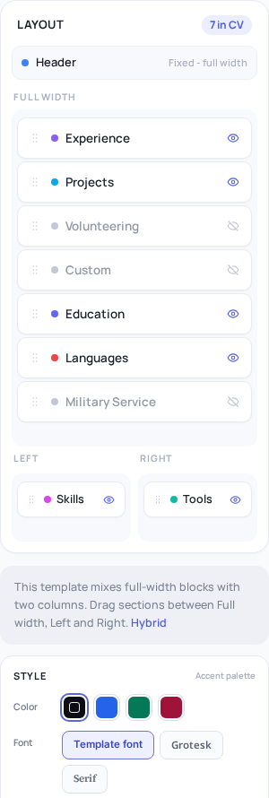
On /panel/profile, you can change the template font in the Profile style controls. That gives you a quick way to compare how the same CV feels in different presentation styles.
CVZilla’s live profile page shows template font controls, including Grotesk and Serif options in the current interface. The specific best choice will depend on the template and the rest of your page.
The key is consistency. One clear font treatment is easier to trust than a page that looks like it changed personality halfway through.
When you are deciding between styles, open the rendered preview and read from top to bottom. A font is only useful if it still feels clear at real page size.
If a font seems stylish but slows your eye, it is probably the wrong trade-off. A CV should feel polished, not precious.
For a broader view of how recruiters read before they study detail, see What a recruiter sees before they read your bullet points.
- Test the font inside the actual CV template.
- Prefer simple, consistent text shapes.
- Use preview to judge readability, not taste alone.
Color use that adds hierarchy without weakening readability
Accent color is most useful when it quietly organizes the page. It can separate sections, support headings, or add structure without turning the CV loud.
In Profile, CVZilla lets you change the template accent color. That is enough control for most job seekers who want a cleaner hierarchy without redesigning the whole document.
Use that control sparingly. A stronger color can help the eye move, but too much color can make the page feel busy and less credible.
The safest question is simple: does the color help the reader understand the page faster? If not, it is decoration, not improvement.
Color should never compete with the text itself. If the page becomes harder to read, the style has stopped serving the CV.
If you want a practical standard for readable contrast, the WCAG 2.2 guidance is a useful reference point for text clarity and visual accessibility.
- Use accent color to guide the eye.
- Keep color restrained and intentional.
- Check that the page still feels calm at a glance.
Simple layout and spacing decisions that reduce visual friction
Font and color do not work alone. The layout around them affects how quickly a recruiter can find the right section.
CVZilla’s Profile editor supports full-width and column-based layout areas. That gives you room to organize supported sections into a cleaner reading path.
Hybrid layouts can use Full width, Left, and Right areas. Those zones are useful when they help the eye move in a predictable order.
The point is not to fill every available space. The point is to avoid crowding and make the structure easy to follow.
If you stack too much into narrow columns, the page can feel compressed. If you overuse multiple visual treatments, the CV can lose the sense of order that makes it trustworthy.
A good layout should feel like a path, not a puzzle. When the structure is simple, the content looks more deliberate and easier to scan.
- Use columns when they improve the reading path.
- Leave enough breathing room around sections.
- Keep section order straightforward.
How to check whether a CV still scans well in a rendered preview
Style choices are easier to judge in the preview than in the editor. That matters because the recruiter sees the rendered CV, not the control panel.
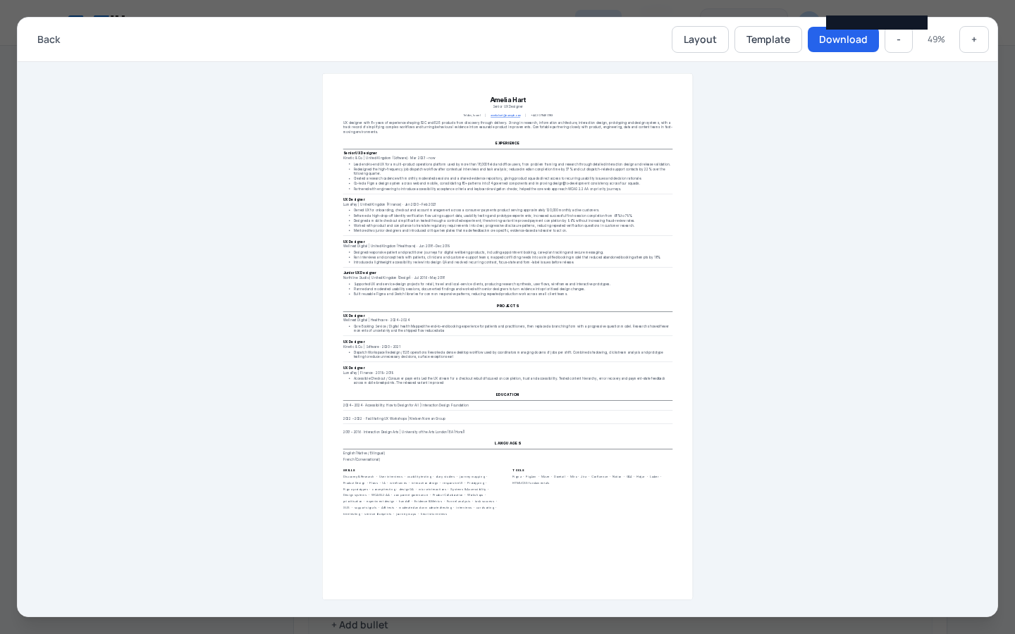
From Profile, you can open the CV preview after changing the template, font, or accent color. Layout and template changes update the editor and preview together, so the result stays visible as you work.
The full-screen preview includes Layout, Template, Download, and zoom controls. Zoom ranges from 20% to 160%, and the current percentage is shown between the controls.
Use zoom to test two things. First, check the page at a smaller view to see whether the hierarchy still reads clearly. Second, zoom in enough to make sure the text still feels clean and comfortable.
This is a practical scanability check, not a design review. Ask whether the page is easy to understand in its rendered form.
If you want a reminder of why the final check matters, the note on The final check that keeps a tailored CV honest fits well with this step.
- Open preview after each meaningful style change.
- Use zoom to test both overview and detail.
- Treat the rendered page as the real test.
Common styling mistakes that make a CV harder to trust or harder to read
The most common mistakes are usually the smallest ones made repeatedly.
Too many fonts can make the page feel unstable. Loud color can make it harder to focus. Cramped columns can break the reading flow and force the eye to work too hard.
Skipping the preview step is another easy mistake. A style choice may seem fine in the editor and still feel awkward once rendered.
If the page looks busy at a glance, simplify before you send it out. The best CV font and color choices are the ones that disappear into the reading experience.
This is where restraint matters. A CV should feel like a well-organized record of experience, not a graphic experiment.
When in doubt, remove one layer of complexity. A cleaner page is usually easier to trust, and trust matters before the first bullet point is read.
- Do not mix too many fonts.
- Avoid loud color that overwhelms the text.
- Do not skip the rendered preview.
- Simplify if the page feels busy.
Small style decisions can make a large difference in how quickly a CV gets read.
Use CV font and color choices to improve hierarchy, not to decorate the page. Keep the layout simple, then check the rendered preview at different zoom levels.
If you want to tune presentation without adding clutter, go back to Profile and adjust the template font, accent color, and preview again before you finish.